drinkcaffeine Branding

About the Project
A Connecticut-based digital marketing agency looking to reintroduce itself with a refreshed company mission decides that it’s also an appropriate time to refresh their visual brand. For this project, drinkcaffeine would undergo a complete transformation of their entire identity system from the ground up.
A New Logo
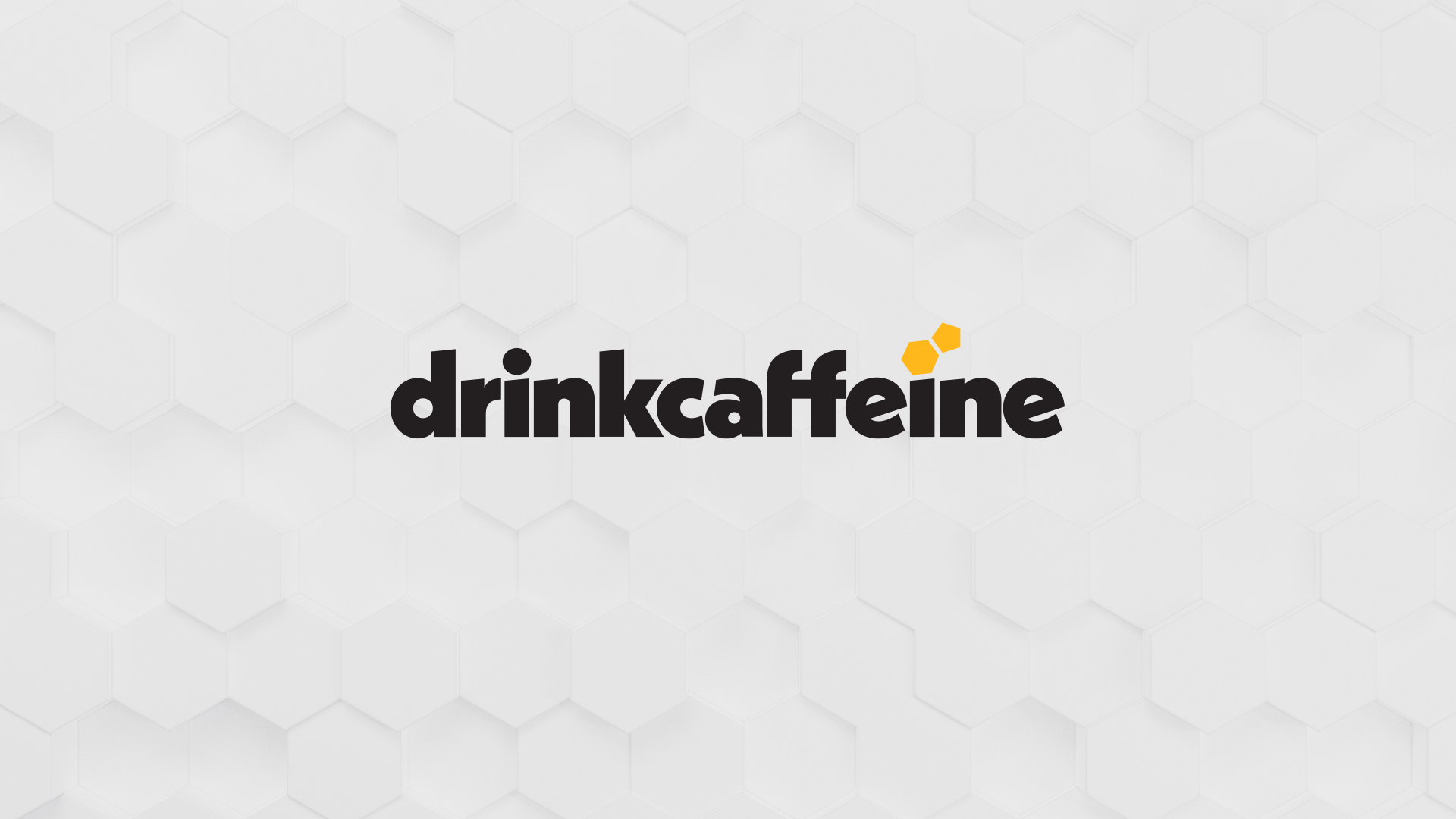
Inspired by the chemical structure of a caffeine molecule, the hexagon-and-pentagon tittle of the letter “i” will become a very important piece of the overall drinkcaffeine brand. It also serves as a subtle allusion to the shapes that make up a soccer ball; an incredibly important sport to the company CEO. The molecule shape introduces an energetic yellow as the primary brand color.
Other Branding Elements
The next step was developing an entire brand identity system. I introduced a hexagonal background pattern, a black rounded-corner border, highlighted headlines, photography and illustration within the brand molecule, and infographics conforming to the same icon shape.
Bringing It All Together
Finally, the look was put into practice: blog graphics, emails, PowerPoint Presentations, webinars, ads, printed collateral. The website was the biggest project, containing landing pages, case studies, blog articles, etc.


