
Pantheon Electric
Brand Identity & System Design


The Challenge

When Pantheon Electric — a newly formed global holding company uniting four legacy copper and conductor manufacturers — came to drinkcaffeine ahead of their market launch, they arrived with a logo already in hand and a timeline that left little room for hesitation.
The logo was the problem.
A heavy, detailed illustration of a classical building sat beside a split-weight wordmark in black and gold — an identity that read, unmistakably, as a financial institution. It communicated stability in the wrong register entirely: conservative, earthbound, dated. Against it sat their tagline: Built to Power What's Next. The visual and verbal identities were in direct contradiction.
Having this conversation with a brand-new client — before the work had formally begun — was not without risk. But sending a global industrial platform to market with an identity that undermined its own positioning wasn't an option. We flagged it, made the case, and they listened.
The Discovery:
Moodboards
With a hard launch deadline and both the brand identity and website in active development simultaneously, we needed a shared creative foundation that could guide both workstreams at once — before either had resolved. Three strategic moodboard directions were developed to establish the emotional and visual territory the brand should occupy. The choices made here would go on to influence not just the logo, but the color system, photography style, typographic tone, and the website design running in parallel. Working concurrently rather than sequentially meant the moodboards had to do more work than usual — they weren't just a precursor to the logo, they were the connective tissue holding two parallel creative efforts in sync toward a single launch date.
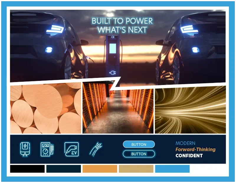
Direction 1: Modern / Forward-Thinking / Confident
A dark, high-contrast world of electric vehicles, data centers, and light-streak photography. Color story: deep navy, copper, sky blue. This direction leaned into the energy infrastructure narrative — dramatic, technological, future-facing.
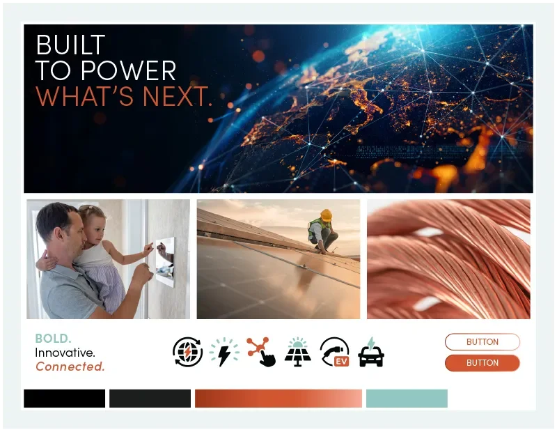
Direction 2: Bold / Innovative / Connected
A warmer, more human take — imagery of families, solar workers, copper wire close-ups. An earth-toned palette of warm copper and sage green, inspired by the material states of copper. This direction emphasized Pantheon as a company that powers everyday life, not just industrial systems.
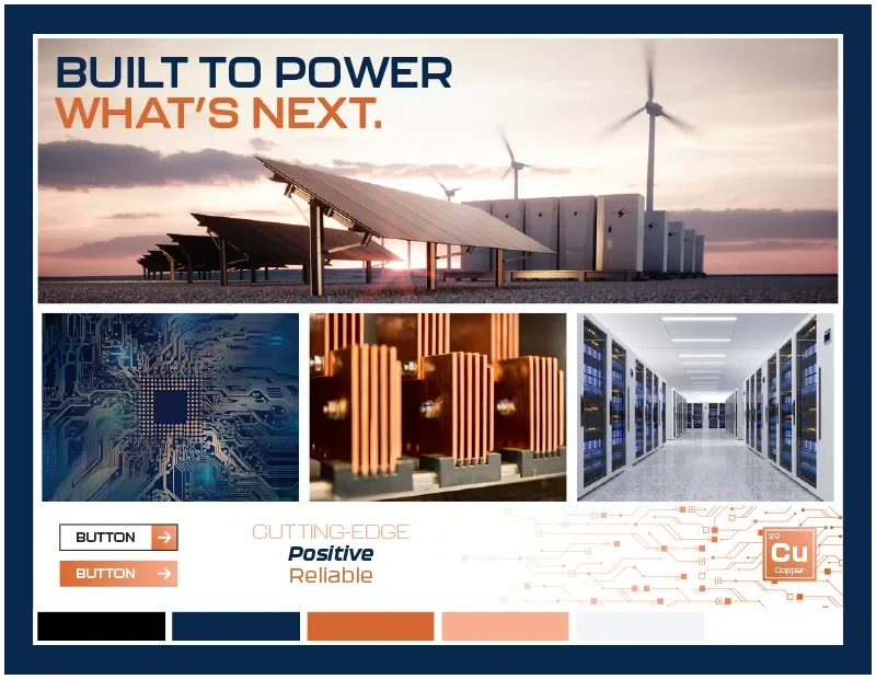
Direction 3: Cutting-Edge / Positive / Reliable
A technology-forward direction. Copper as a material hero. Circuit board geometry as a graphic language.
A palette built from the literal color of the product: orange-copper, navy, and off-white. Keywords: precision, reliability, energy.
The client selected Direction 2 — and its influence on the final identity runs deeper than surface aesthetics. The moodboards didn't just set a visual tone — they gave the client a vocabulary to make decisions with. By the time we moved to logo exploration, we had alignment on where the brand needed to live.
The Exploration:
Five Directions
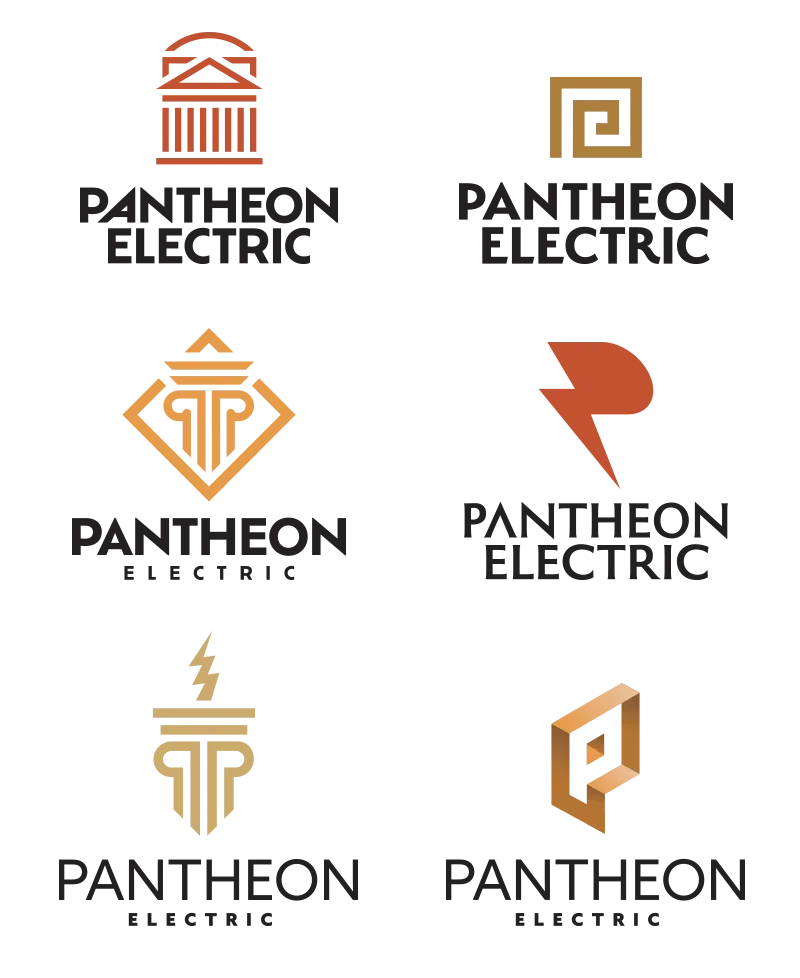
Five distinct logo directions were developed and presented, each solving the brief from a different strategic angle.
Option 1 — The Simplified Building A return to the name itself. The Pantheon in Rome is one of the most recognized structures in human history — a feat of ancient engineering that has stood for nearly two thousand years. Where the original logo rendered the building with heavy literalism (and crammed the wordmark inside it), this direction stripped the icon to its essential geometry: dome, pediment, columns. Clean, confident, scalable. The building as a symbol of enduring strength, not a picture of a building.
Option 2A — Column Monogram (Diamond) A geometric abstraction of the letter P rendered as a classical column, set within a diamond shape. Elevated and structured, with a gold palette that nodded to material value.
Option 2B — Column Monogram (Lightning) The same column-P concept, with a lightning bolt bisecting it from above. A more overt "electric" signal — energetic and direct, but slightly on the nose.
Option 3 — Greek Key Spiral A square spiral derived from the Greek meander pattern — a classical architectural motif reframed as an abstract icon. Distinctive and ownable, with strong cultural lineage. Less immediately legible as "electric," but rich with meaning for those who looked.
Option 4 — P-as-Lightning The letter P doubled as a lightning bolt — bold, energetic, modern. Divorced from the Pantheon reference entirely in favor of pure energy communication. A strong mark, but one that could belong to any electrical company.
Option 5 — Dimensional P Monogram A three-dimensional copper-toned P — architectural and material simultaneously. Sophisticated, but complex to reproduce consistently across applications.
The Solution
The client chose an evolution of Option 1 — the simplified Pantheon building — and it was the right call.
The name already contained the answer. Pantheon Electric had chosen a name with enormous built-in equity: ancient authority, architectural precision, enduring permanence. The job wasn't to abandon that reference but to execute on it with the confidence the name deserved. A clean, geometric rendering of the building icon — dome, cornice, columns reduced to their essential forms — paired with a strong, wide-spaced wordmark in Ofelia Bold.
The color story came directly from the material — both states of it. The primary brand color, a warm copper-orange (PMS 7580), is the color of fresh copper: raw, conductive, elemental. The secondary color, a muted sage teal (PMS 7472), is the color of oxidized copper — the patina that forms when the material weathers and endures. Together they capture something true about what Pantheon Electric actually is: a company built from materials with a long history, still vital and forward-moving. The palette required no justification to the client. It came from what they make.
The result: a mark that feels simultaneously ancient and forward-facing. Built to last — which is, after all, exactly what they make.
The System
A logo is only as strong as the system built around it. Following approval of the primary mark, the work expanded to encompass the full Pantheon Electric brand ecosystem.
Sub-brand Harmonization
Pantheon Electric's four operating companies — International Wire, Hussey Copper, Special Corde, and EMS Elektro Metall Schwanenmühle — each carried decades of established identity equity. The challenge was bringing them into a unified family without erasing the trust each had independently built.
Each sub-brand received an updated logo treatment that maintained its existing identity while introducing the Pantheon color system and a consistent "A Pantheon Electric Company" endorsement. International Wire, with its three operating divisions, received a secondary color differentiation system to distinguish Europe, Engineered Wire, and High Performance Conductors at a glance. The result is a brand ecosystem with clear hierarchy: one parent, four legacy brands, a shared visual language.
Brand Standards
A comprehensive brand guidelines book was developed to govern all future brand expression — covering the primary logo and its variations, color palette with approved tints, typography, photography style guidance across six industry categories, sub-brand logo standards, and file format specifications for every application type.
The Rollout
The Pantheon Electric identity launched across a full suite of brand touchpoints:
Website — pantheonelectric.com, plus one sub-brand site (husseycopper.com in progress)
Brand Video — Full production, from concept through final delivery. Now serving as the hero video on the Pantheon Electric homepage.
Ribbon Cutting Ceremony Video — Post-production and narrative editing. The story was built entirely from pull quotes sourced from the day's speeches, finding the emotional throughline in footage that arrived without one.
Business Cards, Letterhead, Email Signatures — Complete stationery system
PowerPoint Deck Template — Master presentation template for executive use
Retractable Banners, Office Wall Graphics — Environmental identity
Zoom Backgrounds — Digital workplace presence
New Acquisition Logo Templates — A scalable framework for onboarding future Pantheon Electric companies into the brand system
The brand launched publicly in January 2026. The ribbon cutting ceremony at Pantheon Electric's global headquarters in Stamford, Connecticut was attended by Connecticut Governor Ned Lamont. The brand is currently in active rollout as additional sub-brand marketplace presences are updated to align with the new system.
Brand identity and system design: Bryan Betz, Senior Art Director.
Select production execution of physical collateral: Eric Webb, Creative Director.