
The Bus Network
UX Design & Product Design

The Problem Nobody Had Solved
In 2019, if you wanted to charter a bus, you filled out a contact form and waited. Maybe a day. Maybe three. A sales rep would eventually call, ask you questions about your trip, and send you a quote. If you wanted to compare vehicles or add services, you called again. If you changed your mind about the itinerary, you started over.
For an industry built on moving people efficiently, the booking experience was anything but.
Charter bus companies were losing leads not because their service was inferior, but because their booking process required patience most customers weren't willing to give. Meanwhile, airlines, hotels, and rental car companies had spent decades perfecting instant, self-service booking flows. The expectation gap was growing and almost nobody in the charter industry had closed it.
The Bus Network was founded to fix that. Born from a collaboration between DATTCO (one of New England's largest ground transportation companies), drinkcaffeine, and a shared conviction that there had to be a better way, TBN set out to build the instant online quoting and booking engine the industry was missing.
The Team & My Role
TBN was a co-venture, not a client engagement. Kyle DeVivo (DATTCO) brought deep charter industry domain knowledge. Ben Humphreys (drinkcaffeine, now full-time at TBN) owned the backend architecture and the development relationship with Kyle. I owned the consumer-facing UX and UI design.
The process was genuinely collaborative in the way that good product work usually is: Ben and Kyle met weekly to determine what the platform needed to do from an operator and technical standpoint. Ben and I met to work out how a customer should experience it. I would prototype, Ben would present to Kyle, and we'd iterate. Kyle would catch the things neither of us would have thought of without years of charter booking experience; the operational realities that only surface when you've actually dispatched a hundred buses.
The core UX architecture, the booking flow itself, was mine. Built by studying how the travel industry's best booking experiences worked and mapping those patterns onto the specific demands of charter bus travel.
The Challenge: Charter Isn't a Hotel Room
The instinct to borrow from airline and hotel booking flows was right, but charter travel has genuine complexity those models don't account for.
A hotel booking is: dates, room type, pay. An airline booking is: origin, destination, date, seat class, pay. Charter bus travel can be: multiple pickup locations, multiple stops, variable departure times per leg, variable layover durations, multiple vehicle types with different capacities, mix-and-match vehicle combinations for large groups, operator-specific add-ons, and pricing that varies by date, fleet tier, and trip type.
The design challenge wasn't just making something that looked like a booking engine. It was making something that could handle genuine complexity without feeling complex to the person using it.
The Design Process

The project began with wireframes: grey, unstyled layout comps that established the core interaction model before any visual decisions were made. These early wireframes defined the split-panel structure, the step-by-step flow, and the basic information hierarchy for each screen. They were working documents, not presentations: rough enough to change quickly, detailed enough to prototype from.
The most significant evolution happened between wireframe and final on two screens: the Add-Ons step and the Quote Summary. Early versions of both were substantially restructured through the iterative feedback loop with Ben and Kyle, as the operational reality of how charter companies think about pricing and trip confirmation became clearer. The wireframes also explored a Shuttle trip type with a distinct form structure featuring a start/end time range, trip frequency input, and a "Run Continuously" option, as well as a tabbed quote comparison feature that let users generate and save multiple pricing variations under the same quote ID. Both were fully designed and prototyped; neither made it into the current production build, held back by development prioritization rather than design viability.
What shipped was cleaner for the focus. The core four-step flow has remained essentially unchanged since launch.
The Booking Flow: SalesDriver

The consumer-facing booking experience is a linear, step-by-step flow; each screen resolving one decision before presenting the next. A progress bar across the top names each phase: Plan Your Trip, Choose Your Vehicle(s), Select Add-Ons and Extras, Confirm Your Itinerary.
Step 1: Plan Your Trip
The itinerary builder opens to a split-panel interface: a dark-themed form on the left, a live Google Maps view on the right that updates in real time as addresses are entered. The form distinguishes clearly between Pick-Up Location, numbered intermediate Stops, and Drop-Off Destination as separate labeled cards; a visual hierarchy that makes complex multi-stop itineraries easy to scan and edit.
Each stop auto-calculates estimated arrival based on routing. Departure time is set manually, giving users control over layover duration. The map traces the confirmed route in real time as stops are added, providing immediate visual feedback. Utility controls — Add a Stop, Return (Reverse Route), Return Directly to Origin — let users build and modify itineraries without losing their place.
The design accounts for failure as carefully as it accounts for success. An inline "Short layover time" warning fires on the active stop card when a departure time doesn't allow realistic transit, surfaced in context instead of a modal interrupt. If the user attempts to proceed without completing required fields, every incomplete card highlights with a red border and inline validation messages, and the Continue button remains inactive until the itinerary is valid.
Step 2: Choose Your Vehicle(s)
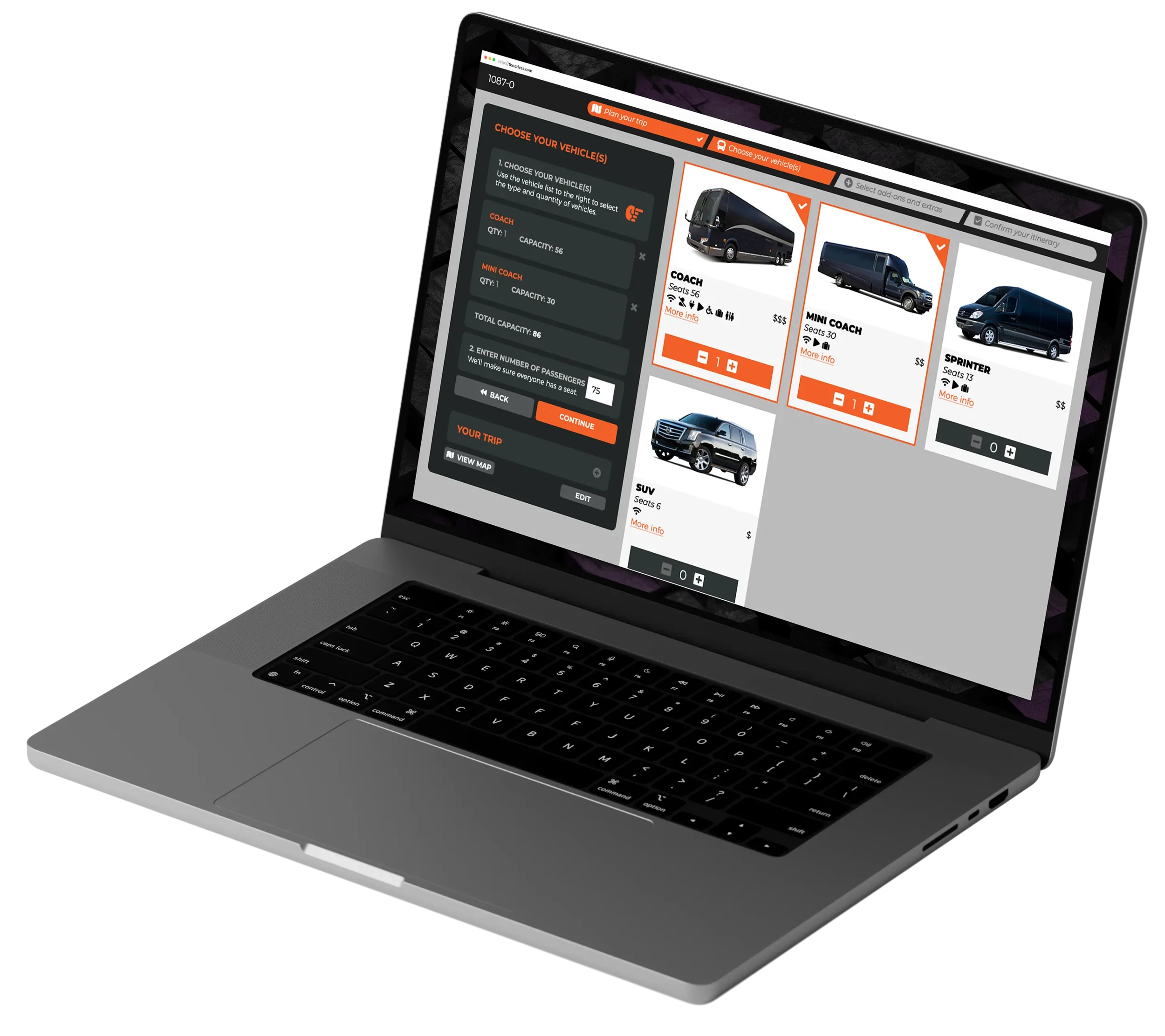
After the itinerary is confirmed, the user enters their passenger count and is presented with the operator's available fleet as a photo grid. Each card shows the vehicle name, seat count, a relative price tier indicator, available amenities (WiFi, power outlets, accessibility, luggage), and a "More info" link that launches a modal window with a more in-depth description. Quantity is controlled with stepper buttons directly on the card. Selected vehicles are highlighted with a brand-color border and checkmark, and appear in the sidebar with a running capacity total that updates in real time.
If selected vehicles don't cover the entered passenger count, an inline error prompts the user to add another vehicle — guidance rather than a dead end.
The design handles sold-out scenarios with equal care. When fully booked for the selected dates, the entire fleet grid renders in grayscale with "SOLD OUT" overlays, and the sidebar presents two recovery options: Change Date or Join Waitlist. The waitlist flow allows users to indicate their preferred vehicles if availability opens up and a branded confirmation screen closes the loop. No lead is lost.
Step 3: Select Add-Ons and Extras
The add-ons step uses a two-panel layout: a persistent sidebar on the left tracks selections in real time alongside a collapsible summary of the trip and vehicle choices already made, giving the user continuous context while they browse. The right panel presents available add-ons as a clean list with each row showing the service name, pricing logic (per passenger, per vehicle per day, flat rate, hourly), and a quantity stepper or include toggle. Whatever the operator configures in the admin appears here; nothing is hardcoded. The step is intentionally lightweight and never blocks forward progress.
Step 4: Confirm Your Itinerary
The final pre-submission screen presents the complete trip summary in a single full-width card: full itinerary with stop-by-stop distances and estimated arrival times, selected vehicles with quantities and subtotals, add-ons with pricing breakdown, and a prominent total. A "View Map" link surfaces the route on demand rather than displaying it inline — a deliberate choice that keeps the summary scannable. Each section has its own inline edit control. From here the user can decline, save their quote, or submit the booking request directly.
A checkout and payment screen extends the flow for operators who accept deposits online, with support for discount codes and partial payments.
The booking engine was the product. The websites were the proof of concept.
As charter companies adopted TBN's platform, many came to drinkcaffeine for full website redesigns, wanting their online presence to match the quality of the booking experience their customers were now getting. Each redesign worked within the company's existing brand; these were not rebranding projects but new digital presences built around the TBN integration.
Young Transportation (Asheville, NC)
Young's site leans into their brand personality with a dynamic stripe graphic system that carries through every section, a strong hero, and a stats bar leading with their 87-year history and third-generation ownership. The "Trusted by Champions" section, featuring university athletic programs, is the kind of social proof that earns trust before a customer ever clicks Request a Quote.
Jefferson Tours & Charters (Louisville, KY)
A dual-service company offering both charter and curated tour packages, Jefferson's site needed to serve two distinct customer journeys without confusion. The result leads with clear service bifurcation — Group and Custom Tours vs. Charter a Trip — and carries a rich gold and black palette through a design that feels premium without feeling corporate.
DATTCO (New Britain, CT)
The origin client and the platform's first live implementation. DATTCO's site anchors on strong fleet photography and leads with comfort and safety as primary brand values, reflecting a company with over 100 years of operation and the reputation to back it up.
The Operator Side: OpsDriver
The Websites
The Outcome
The SalesDriver booking flow design has remained essentially unchanged since its original release. Not because the platform hasn't grown (it has, substantially, into a full product suite), but because the consumer-facing UX holds up. As of 2026, TBN has generated over 253,000 quotes representing more than $875 million in quote volume across 108 member companies operating nearly 6,000 dispatchable vehicles.
The platform is now its own independent company. The website design work it generated for charter operators across the country became a sustained revenue stream for drinkcaffeine for years after the initial build.
And an industry that had normalized "fill out a form and wait" now has a better answer.
The consumer booking flow was only half the product. OpsDriver is the operator-facing platform that receives, manages, and fulfills everything SalesDriver generates; a full back-office suite that grew from a simple quote dashboard into an enterprise management tool.
The navigation system evolved with the product. An early side-nav approach was replaced with a top-nav structure as the platform's feature depth grew beyond what a sidebar could cleanly accommodate. Each top-level section — Sales, Operations, Financial, Reports, Company Setup — opens a secondary contextual nav. Operations covers Bookings, Dispatch, and Vehicle Inventory; Financial covers Accounting, Payroll, General Ledger Codes, and Taxes; Company Setup covers Account Settings, Vehicle Types, Add-On Types, and Yards. The information architecture had to scale to enterprise complexity without feeling enterprise-heavy.
Quote Management
Every quote submitted through the consumer flow lands in a filterable, paginated table with color-coded status rows for instant visual triage. Clicking into a quote opens a comprehensive detail view: customer information, quote status and salesperson assignment, activity log, trip summary with stop-by-stop driving and on-duty hours, vehicle info with suggested and override pricing, and add-ons. Quick actions at the top surface the most common next steps without hunting through menus.
Directly from the quote detail, a sales rep can compose and send a follow-up email to the customer. A rich-text editor opens in a modal over the quote, pre-populated with the operator's branded header image, the quote ID, and editable body copy. The email includes configurable CTA buttons and the rep's email signature. A confirmation gate fires before sending, preventing accidental dispatch. The operator's own logo and brand color carry through every screen; to the customer, every touchpoint reads as coming from the charter company, not a third-party platform.
Financial Overview
A payment status dashboard presenting upcoming and prior trips in separate tables, each row showing booking number, departure date, pickup location, trip reference, total price, amount outstanding, and payment status. Overdue rows highlight in red for instant visual priority. A "Pay Now" action opens a Make a Payment modal: a full payment processing flow supporting credit card (customer present or online processing), check, bank transfer, and cash, with each payment type adapting its form fields accordingly. A "Payment Successfully Applied" confirmation screen with confirmation number and email notification closes the loop. This is a complete financial management workflow, not a simple payment button.
Pricing Calendar
Operators set dynamic pricing by date across fleet tiers and time periods (base price, off-peak weekday, off-peak weekend, etc.) through a visual monthly calendar. This is the engine that makes real-time instant quoting possible on the consumer side. Every price a customer sees is calculated live against what the operator has configured here.
Senior Art Director: Bryan Betz (drinkcaffeine)
Developer: Ben Humphreys (drinkcaffeine / TBN)
Industry Consultant: Kyle DeVivo (DATTCO / DeVivo / TBN)
Timeline: March 2019 – April 2021 (platform ongoing)
Live: tbndrives.com